Across 100 years, the layout of the Setonian has changed over and over.
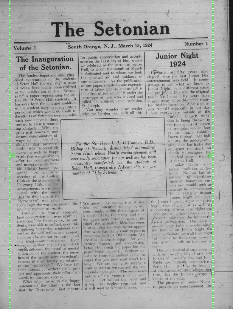
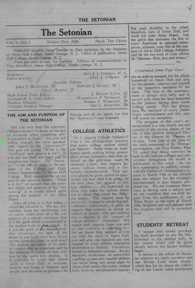
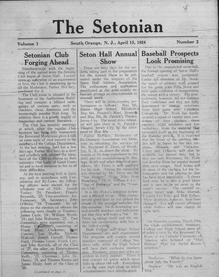
The Setonian's first issue came out on March 19, 1924. It was a simple design with a main logo font adjacent to Lora. The front page was divided into three columns with a space in the middle introducing the newspaper. That introduction would open the door for 100 years of Setonian articles. The interior of the article continued to be divided into three columns with the top corner designated to note the very first group of editors for the Setonian.
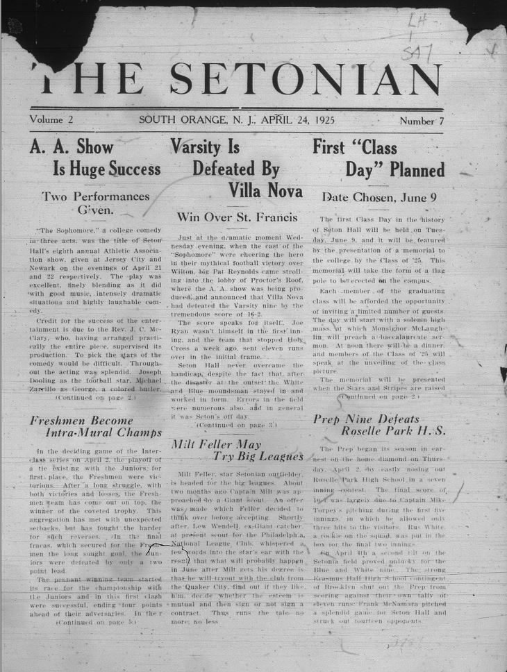
A year after the first paper was published, the Setonian layout received some changes. The title was changed to a much wider font similar to Times New Roman font, and the columns were split in half to display six featured news stories (#4).
This is where we begin to see the first few trends for the Setonian. One section that specifically started in 1925 was the class notes trend. Essentially, one person or a handful of people from a specific year would be chosen to represent some aspect of news for their class (#5).
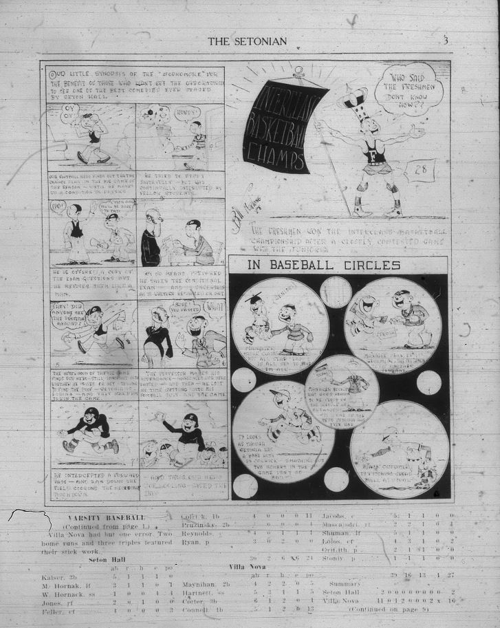
This trend would stay for almost the next 30 years until the Setonian developed a different style of featured news story writing. We also see the first comic strip and sports statistics section appear in an overlap of funny characters winning games for the Pirates and their statistics underneath (#6).
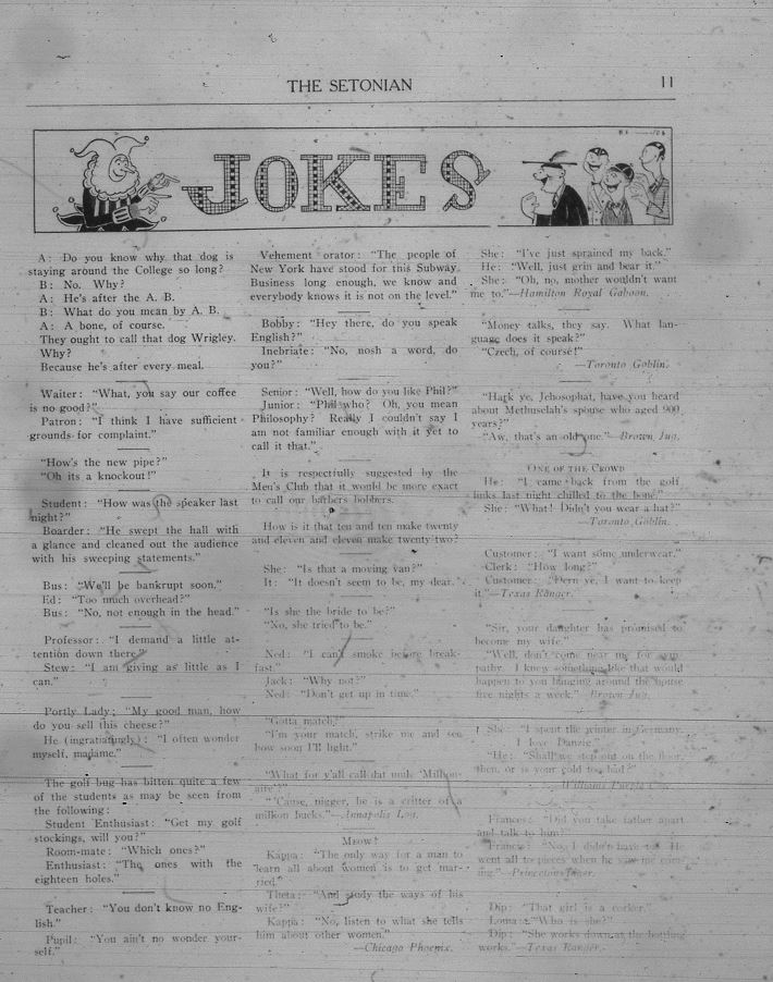
A traditional joke column is also introduced with a sectioned-off header that displays a cartoon character of a jester and what appears to be college students laughing on the opposite side (#8)
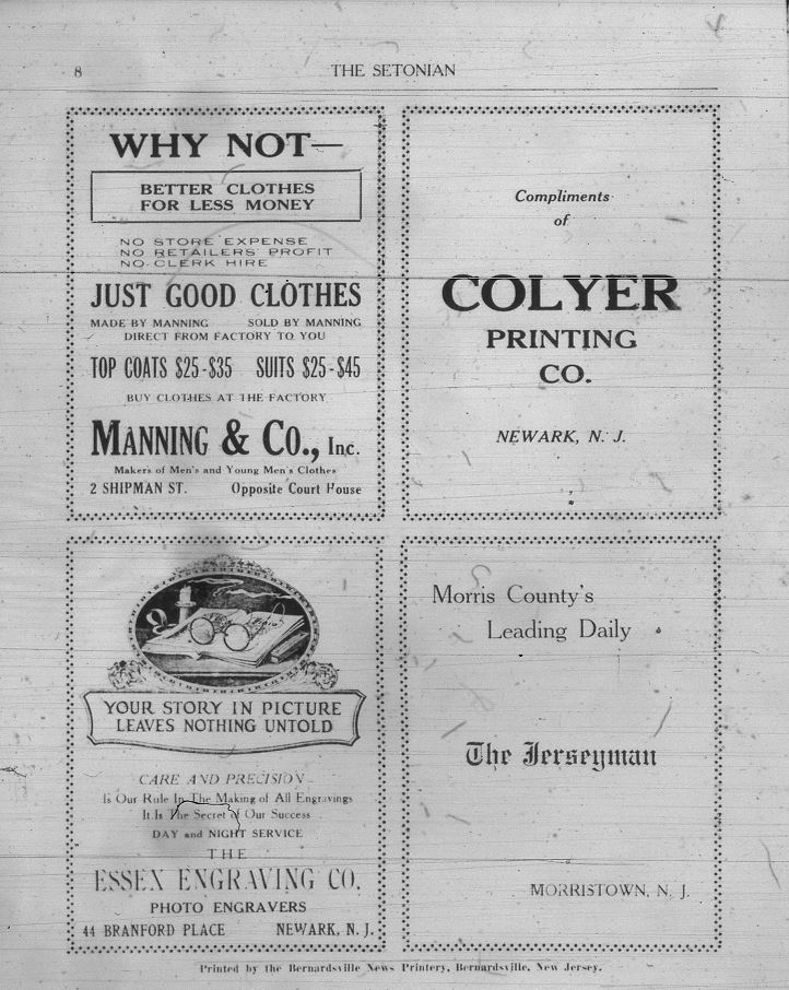
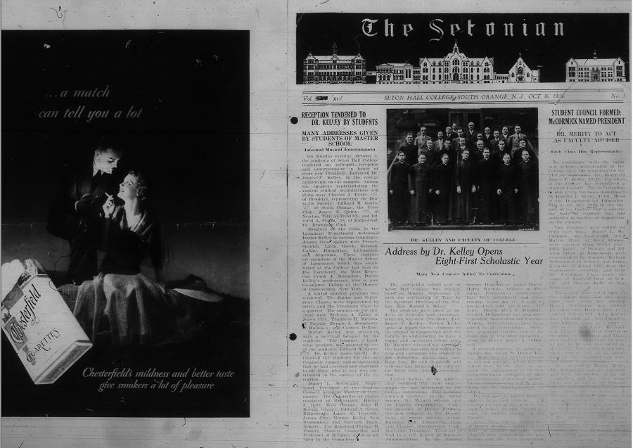
A year later, the title font changes again to something adjacent to the New York Times serif (#7). Here the Setonian starts to introduce advertising which begins as four postings staged in a square together (#9).
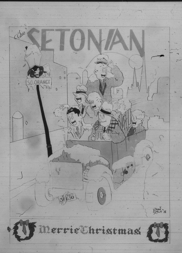
Later in 1928, the subheadings get darker, and there is a heading to the subheadings in all caps that highlights a central story (#10). In that same year, the Setonian dedicated an entire page to a cartoon sketch of college kids driving down Winter Street to wish every pirate a Merry Christmas, and so began a tradition of holiday edition newspapers (#11).
Another trendy segment within the first decade of the Setonian's first publication was the “Poets Corner” dedicated to students' poetry. The last format change in the 1920s was sectioned off headers, photos for the profiles of featured students, and double bars to section off separate stories (#13).
The first issue of 1930 kept all of the format changes from the previous decade but also introduced the idea of having photos on the cover pages to make the stories a bit more eye-catching (#14).
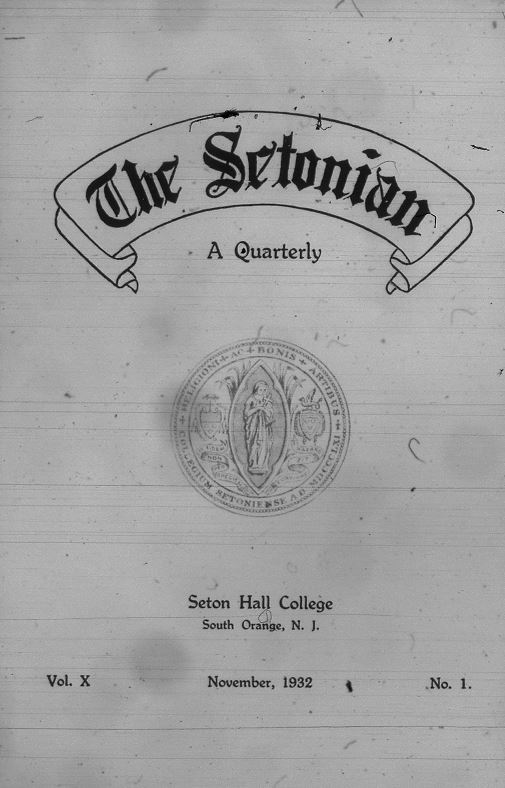
A few years into 1930, the Setonian switched from a regular newspaper to a quarterly publication due to circumstances surrounding the Great Depression. The cover page of the publication is quite distinct, featuring “The Setonian” banner above a centered, stamp-like imprint of the 1930s seal design (#15).
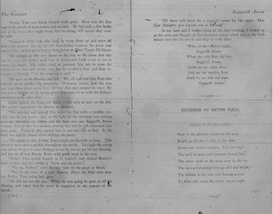
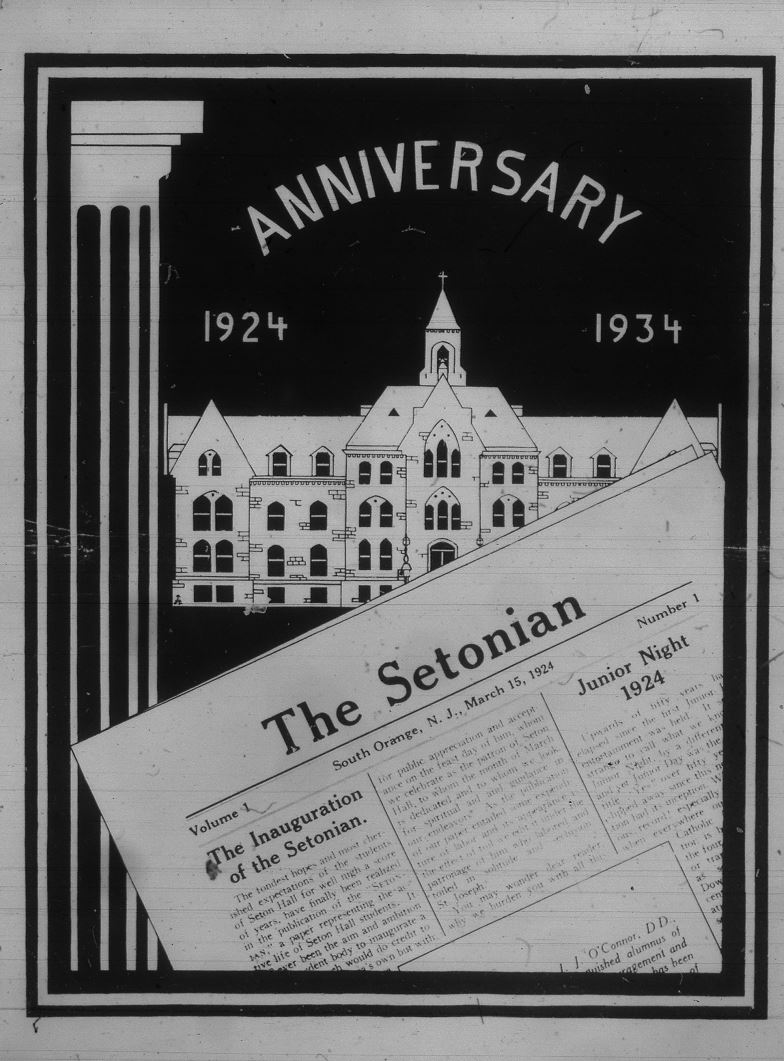
For the usual editions, the interior becomes a lot more compact with stories and advertisements sharing the same page (#17). In 1934, the 10th anniversary of the Setonian was celebrated with a full-page print with a dark backdrop that placed the school and the first edition of the Setonian together to compare the two years (#18). To celebrate the first decade, the Setonian’s title has a completely different look. It's gone back to its Times New Roman style but now has President’s Hall in the backdrop of the title (#19).
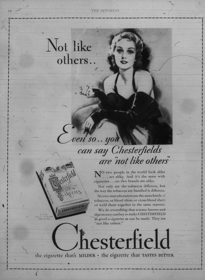
Advertisements also take on a new look. One of the first advertisements to take up a full page is an advertisement for Chesterfield cigarettes portraying a classy 1930s woman and a Chesterfield cigarette box (#20). Darker coloring continues to be used for almost entire pages at some point for advertisements and design headers by 1936 (#21).
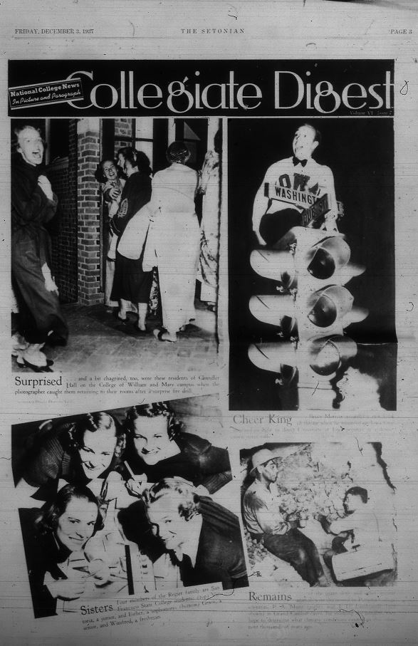
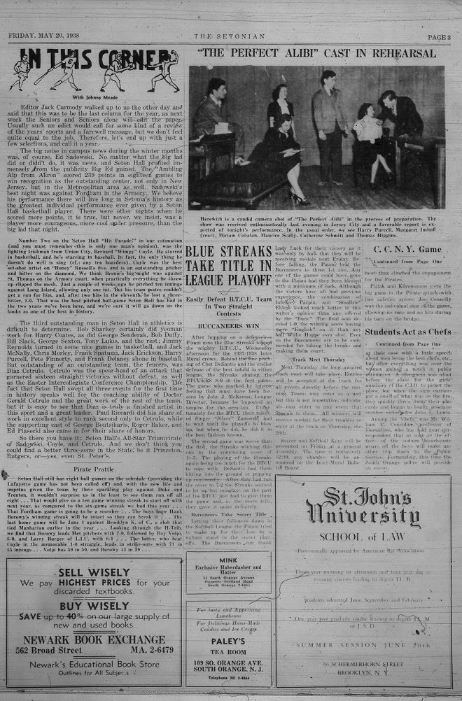
The “Collegiate Digest” trend represents a short-lived style where a collection of collage-like photos were built together to create a fun, yet sentimental reflection on the college experience (#22). By 1938, advertisements, subheading drawing designs, featured news stories, and photos could be seen all on one page together (#23).
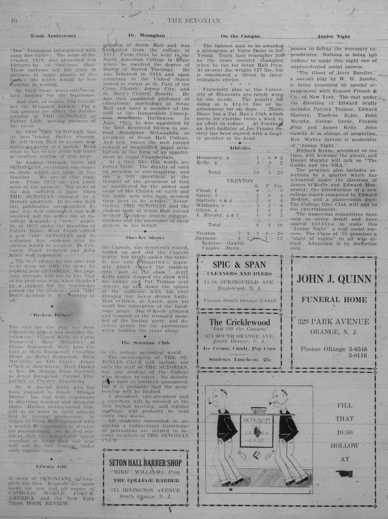
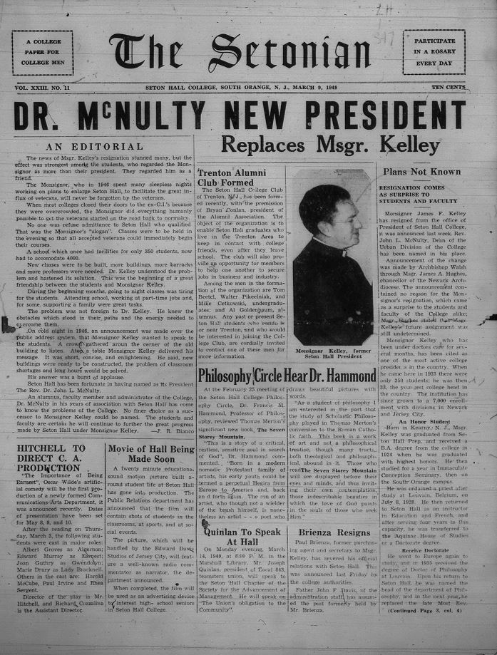
Ten years later in 1948, we see WSOU going on air which opened the door for announcements on other club events, as well as the new concept of “Queens” at the coronation dance which was a concept where girls could be elected by anyone on campus to be chosen as campus Queen (#24) (#29). The year 1949 closes with a more complex opening page where the header has gone back again to Times New Roman style and the leading feature story has an even larger subheading. The paper itself is more complex now with almost eight stories on the first page alone (#25).
The Setonian experienced a completely new header change in 1950 with a lighter cursive raised to the top left of the Setonian which is bolded and in an italic serif font. The seal is printed in the center of the Setonian (#27) (#28). By 1954 pictorial reviews came into trend with covering Seton Hall's basketball games. the photos are also marked up with funny rhetorical like “who dropped the ball” or “look so easy” (#29).
Volumes in the 1950s were very interested in graphics alongside their future story writing all together squeezing in as much as they possibly can onto one page (#30).
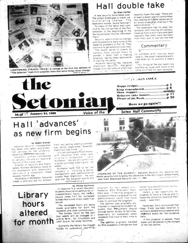
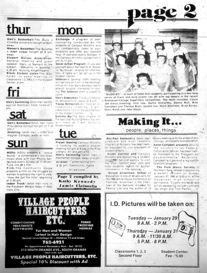
By 1980 the Setonian experienced a complete style change. The title slides across the center of the page in a very sitcom-style Arial font. The page itself is divided horizontally into four rows including the title section (#32). The second page of these volumes is marked very clearly as such (See top right corner) and separates their news by upcoming events happening on Monday through Sunday (left column) (#33).
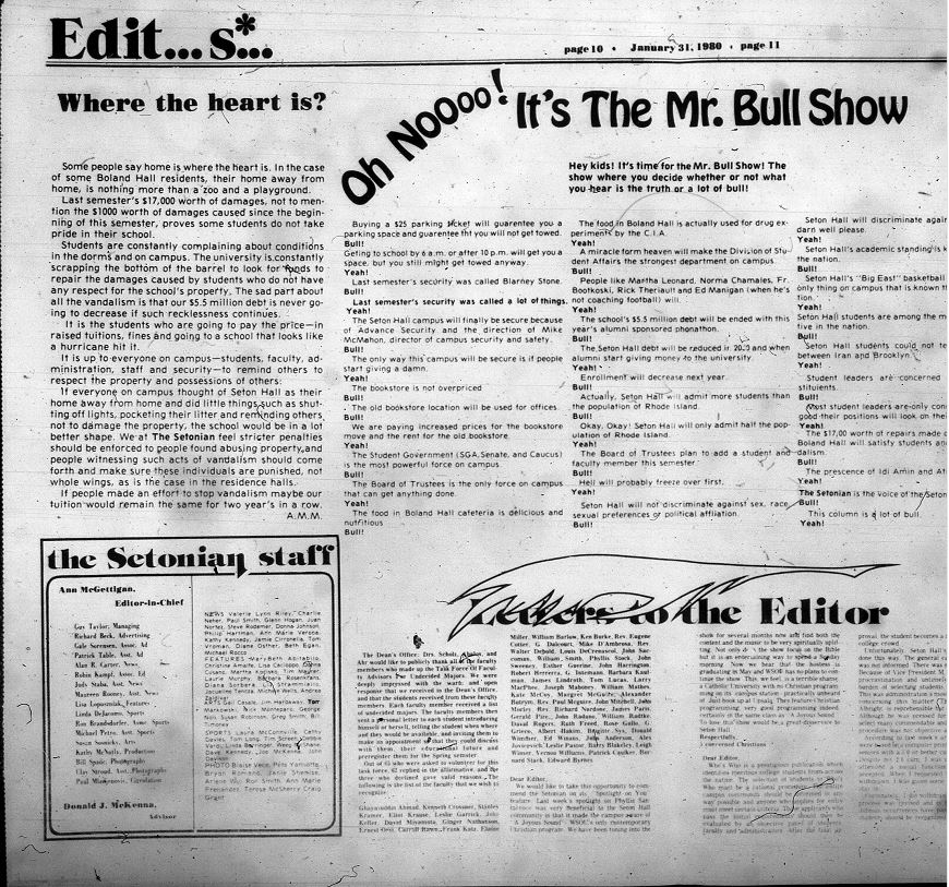
The 1980s to 1990s used full-page advertisements to promote club activities on campus like SAB events (#34+#38) Additionally, advertisements became sectioned off in more flowery borders and dynamic fonts (#36).
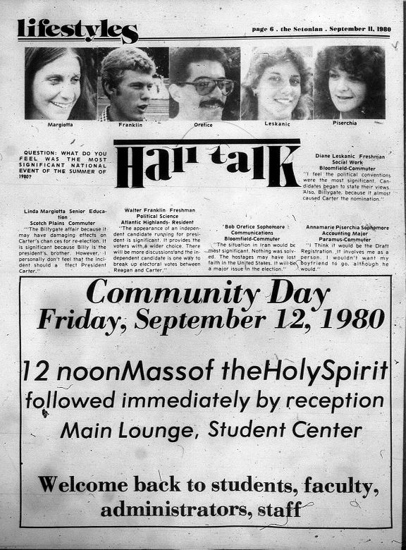
Volumes for 1980 are also interspersed with full landscape pages which include trends like “The Mr. Bowl Show,” letters to the editor, and more (#37). They also began to experiment with different fonts for different news categories like “lifestyles” throughout one advertisement (#39).
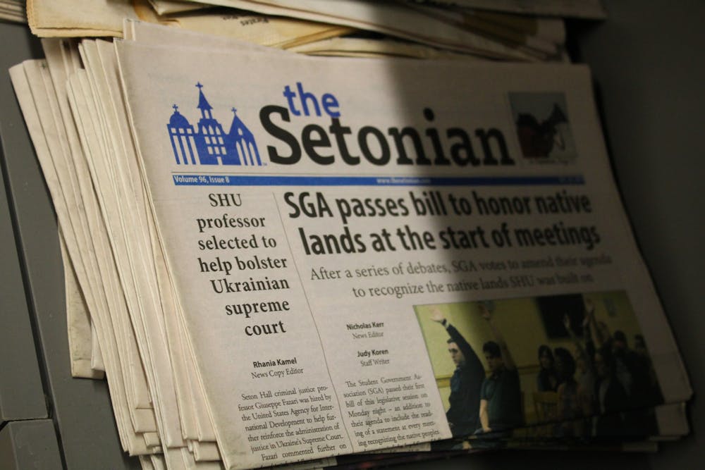
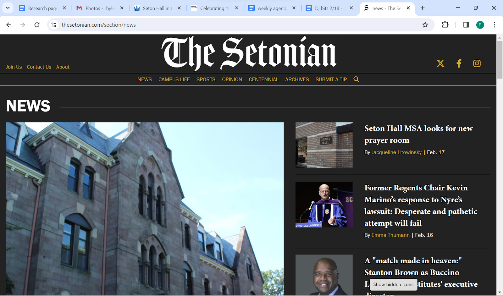
Now with the Setonian online since 2004, there have been a few format changes to fit the online medium a bit better. For one, we've gone back to the New York Times style logo, which is set between two forms of contact sections: a join us, about us, and contact us section and links to the Setonian’s X, Instagram, and Facebook accounts.
Just beneath are the row of categories the Setonian writes for. They are News, Campus Life, Sports, Opinion, Centennial, and a link to the Archives. The backdrop is a dark gray with gold to highlight author names, more information, and split rows.
Each week, the leading feature story and “Submit a Tip” for news suggestions. Its designated photo is the first and largest piece of information on the online format to the left. More stories, their authors, and their dates of publication as well as a sentence or two into the story are posted without photos beside it, and editors' picks are in the column farthest to the right. Scrolling down to the bottom will lead views to the Setonian’s social media links (#40).
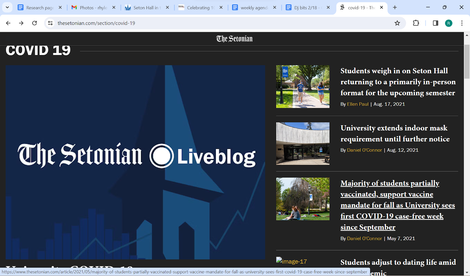
Archives include a COVID-19 edition that focused solely on news affected by the virus from 2019 up to Dec. 16, 2021, after which the paper returned to its current online format (#41).
#3 1924 vol 2– three columns for news more distinct #4 1925–progresses to 6 column
#5 1925-class column trend #6 1925- comic strip and sports stats

#7 1926-font change #8 1920s joke column

#9 1920s advertising #10 1928–six columns
#11 1928 Christmas

#12 1920s poets corner
#13 Double bar+ photos
1930s-

#14 1930’s first issue
#15 1932 quarterly style
#16 Inside the quarterly
#17 1934 inside style(closer compact)
#18 10-year anniversary

#19 1934 new look
#20 1930s cirret advertisement
#21 1936 advertisement and darker coloring
#22 1937 interesting photo layout spread
#23 1938–everything on one page

#24 1948 Wsou, queen, +new header font
#25 1949–more complex opening page
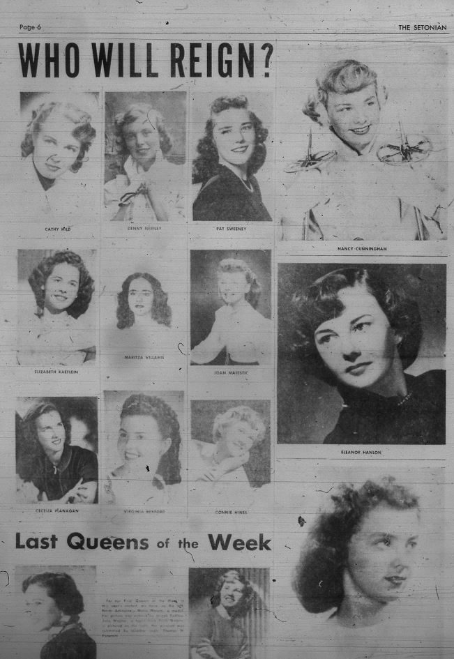
#26 1949 ish Queen of the week
1940s-
1950s-

#27 1950 Title font change
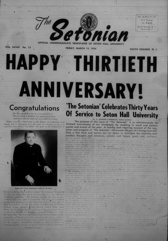
#28 1954 30 year anniversary
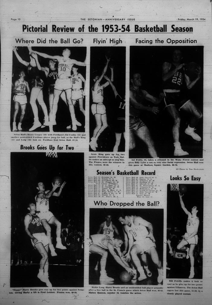
#29 1954 basketball review/pictorial review w/commentary
#30 Graphics and feature story writing

#31 50s more advertising than writing
1980s-
#32 1980 opening page
#33 1980 page two notice titles

#34 1980 SAB ad
#35 1980 four adverstisements and border
#36 1980s advertisements and news
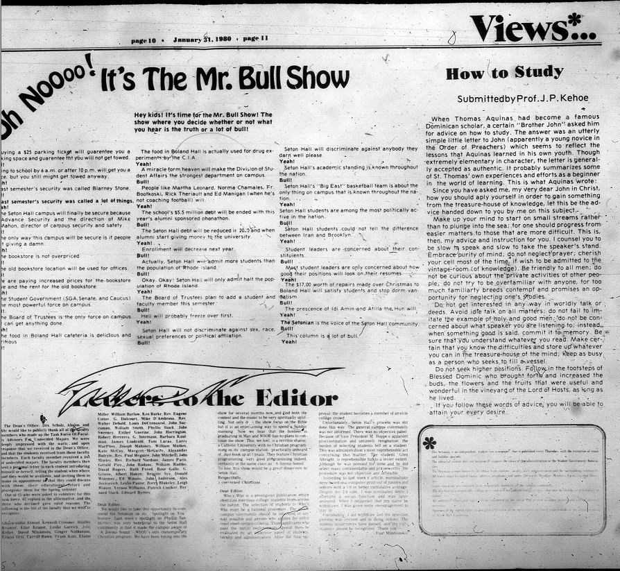
#37 Wide layout;mr bull show;etters to the editor
#38
#39
Rhyleigh Russell writes for the Campus Life section. She can be reached at rhyleigh.russell@student.shu.edu